Electronic Medical Charting
A therapist services company approached me to turn their paper charting processes into an app. The company sends therapists out to visit hospitals and care facilities, and the therapists have to fill out a series of forms for each patient they see, as well as for the overall facility visit for that day. They were looking for me to make the app presentation a bit easier to use and look nicer.
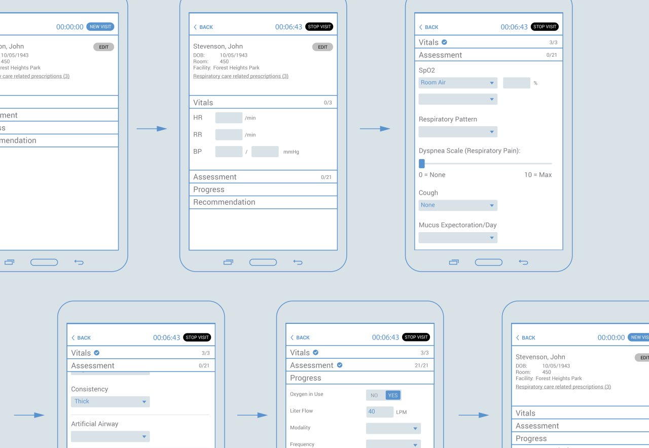
I walked through the therapists’ activities, questioning them about when they were expected to fill out their forms. To my surprise, most charting happened after the visit – not during. It was just too cumbersome and intensive to be focusing on paper forms while seeing a patient, and other than detailed vitals, most therapists left most of the charting toward the end of the day. This seemed to open up the process to inaccuracies. Therapists did want to take down their details while visiting patients. The current process just didn’t work for them to do that.
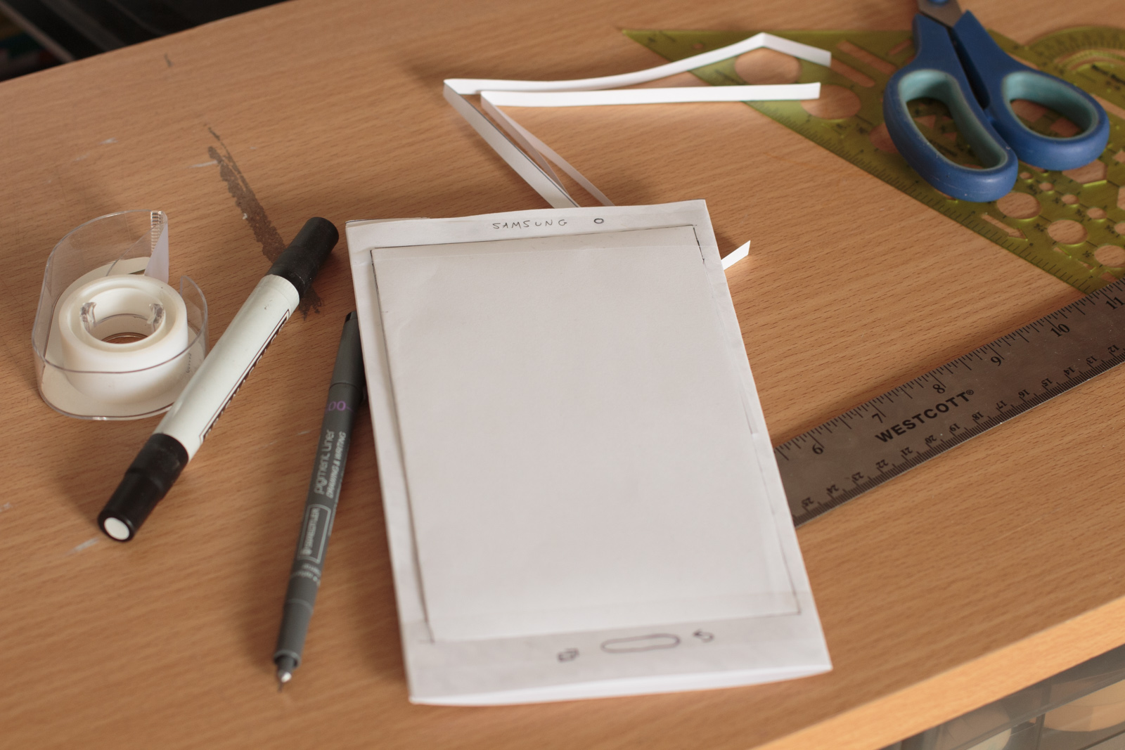
The company had chosen to purchase the 8″ Samsung Galaxy Tab 4 for their therapists. The small and lightweight design would be easy for them to carry around throughout the day, leaving their other hand free to carry other items, as needed. I didn’t have that specific tablet in my arsenal, but I wanted to get a better feel for the dimensions. Also, since the nurses would be primarily walking around, I wanted to make sure buttons and text were large enough to see while holding the tablet at a comfortable level. Since this project was to have such a short turnaround, I decided to mock up my tablet with paper and tape, with the help of my trust xacto knife.
That exercise gave me some really good insight. The Galaxy Tab 4 has an unusually tall design, with buttons positioned on the bottom, which made me think landscape use wouldn’t be comfortable. Given the small size of the tablet, and using it while walking around, I decided to design as if it were a phone, making things somewhat larger, with lots of whitespace. Therapists have action-packed jobs, always on their feet, running around hospitals, and I wanted everything to be easy to read and use for only 1 hand, if necessary.
After that, I focused on the paper charts themselves. I broke the forms down into sections, and created rules to only show certain fields that were depending on other fields to be filled in. That made the forms instantly less cluttered. Since we weren’t as tight for space and we were dealing with a digital canvas, I thought another thing to do to make the forms easier to use would be to get rid of shorthand codes and abbreviations. That was a mistaken hypothesis, though. After interviewing nurses and therapists, it became apparent that these codes and shorthand were second nature, and spoken and understood as freely as regular old English. Spelling things out might actually hurt usability. So I didn’t do that.
We were also able to gather certain information, automatically from the system, and reduce redundant entries. All in all, the charting process was seen as infinitely easier and faster than before, and the therapists were excited to get things done in the room with patients, improving accuracy, saving time, and no longer needing to stay late to finish up their tedious paper charting tasks.
Project Details
Skills UX Design, UI Design, User Research, Wireframing, Mobile, Xacto Knife