Eved

Background
Eved is an enterprise spend management startup based in Chicago. Their platform served many types of customers and user roles, and users were very change-averse, sometimes coming from very big companies with very specific business processes. I knew I couldn’t just come in and redesign everything at once. There wer lots of egregious usability mistakes – the product was initially built by engineers without designers – and users needed to attend multiple training sessions to learn the system. I had to fix a broken system which did not have any design in it’s DNA. I had to make things look and work great, and create a culture of design.
Being the only designer in a scrappy, fast-moving team, I knew I needed to pick my battles and aim for the biggest return on investment for my client. There wasn’t always time to explore the details, hypothesize about ideas and test and iterate pie-in-the-sky concepts. I needed to keep up with the development train but also affect change.
After working with them for a few years, they drafted me as Director of Design to help scale up the team and product.
Project Details
Skills UX Design, User Research, UI Design, HTML, CSS, JQuery
Year 1 – Removing Obstacles, Cleaning Up
Keeping up with the existing development cycle, I focused on fixing usability errors, and incorporating broader design updates within the immediate releases. I was able to fix things like information architecture even though the immediate release dealt with something like browsing a product catalog. It was the only way those updates were going to happen.
I fixed things that were broken: confusing and incomprehensible Information Architecture; poor typography choices; and difficult searching and browsing paradigms. There were really bad interaction patterns, like nested tabs (select a tab, and then you’d be greeted with a new set of tabs until you found what you were looking for).
Result: Less complaints, faster development cycles
Year 2 – Boosting Efficiency
I focused on consolidating interaction patterns and creating an efficient and scalable interface. I created a universal pattern library, and documented patterns in a shared Evernote folder. The global patterns helped users with learnability, and streamlined our engineering process.
I also started working with engineering to create a more efficient platform. For example, to replace ad hoc file upload (which used a different paradigm every time), I created a universal file-share system, so uploaded files would be accessible everywhere and the UX for attaching files was consistent across the app.
Year 3 – A New Dawn
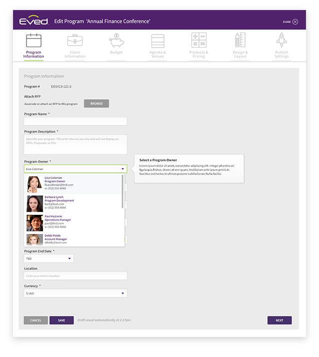
I needed to modernize the UI and design for the future. The visual design up until now was 6 years old. It was time for a UI refresh – an overhaul I codenamed Dawn – which would grow with the company, and be more easily updatable when the time came. Resources were always tight, so I waited for the right moment to pitch – when the pain point really hurt. I couldn’t just roll out a new UI and redesign the entire platform at once, so I needed to create something which could be rolled out modularly. Color and style changes had to be made very carefully.
Things were coming to a head about 2 issues which I knew needed fixing. I created solutions for both of them in the new UI style. At one meeting, there was a lot of discussion about what to do about these problems – things had reached a point where the problems were clear to everybody, including the CEO. They turned to me and asked if I had ideas. I said I actually did and offered to share my screen.
The new UI, as well as the 2 design solutions were extremely well received, and it opened the gates to an overhaul. The new UI would start being implemented in all new product development moving forward. It made sales calls easier and was light years ahead of the competition.
Result: Investors were impressed, which made raising a new round easier. Shorter sales cycles as prospects understood and liked what they saw.
Year 4 – Bigger and Better
By this time, I had ended my relationship with Eved and joined a VC fund in Jerusalem as Designer in Residence. I had a pretty sweet gig and was done consulting. Eved kept asking me to do more work for them, but I wasn’t interested. Finally, since they had just raised a successful new round of funding, they made me an offer I couldn’t refuse – an opportunity to grow my team and take the company to the next level.
My goal was to build more scalable product design processes. I wanted to make sure we were more informed when we started new initiatives, and our UI had to be tighter across the board. For every new product design idea we started on, I kept asking “what if we need it to do this?” and made sure it would scale with more customers.
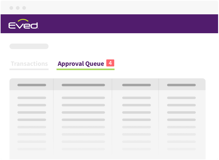
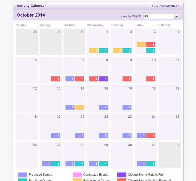
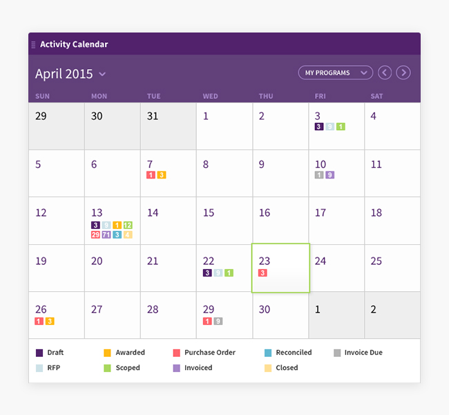
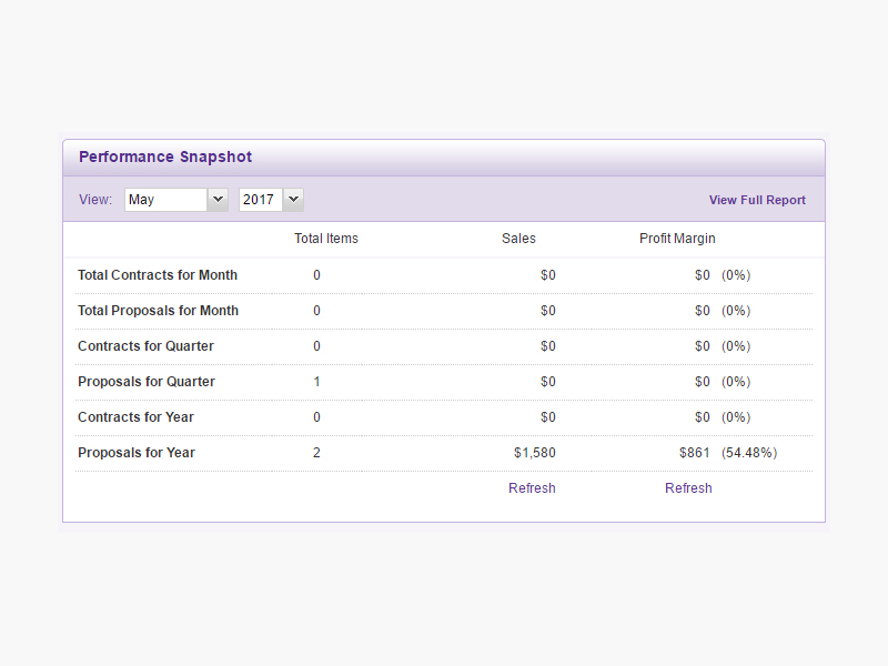
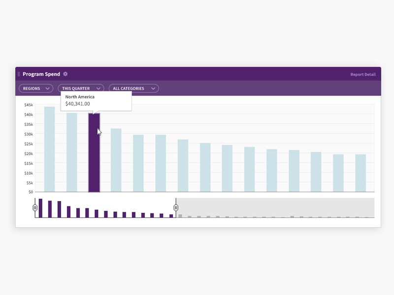
The led us to develop more robust, enterprise-level products. Powerful approval setups for managers and users. Better search. Consistent look and feel across our platform. And better visibility and manipulation of data in our reporting.
Result: By the end of the year, I grew our team to 4 and got Marketing to be folded under Design making us a team of 6, and kicked off a sorely needed website redesign initiative. I also integrated Intercom and better analytics to make us more informed about usage. Our product was more powerful and beautiful then ever, and we started getting the biggest companies in the world on Eved!
Before and Afters:
But wait, there’s more!
- Created more than a dozen brands for dummy data
- Produced video walk-throughs for training
- Created an internal newsletter to evangelize design – including accompanying illustrations
- Website redesign (a later marketing director decided to redo it herself in hubspot…)
- Pushed to improve communication from email to slack
- Implemented Intercom for better user data and engagement
- Got a CEO to start caring about users
- Created sub-brands of products
- Helped align teams to better serve our users (sales, marketing, accounts, support and product)